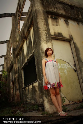


 Finally i upload tis set picture..yea,i m done edit since last week but i don have the time and mood to write here..so delay until today..sorry for tat..
This time also same,my team with me shoot for Suzan and Rennie..as last time i shoot Rennie so this time is turn to shoot for Suzan..
So this abandon shop lot actually is located at Maluri,i m not too sure this place bcause i also first time visit there..but as i know got many photographer n model use there as shooting background also..Yup,since Suzan like the picture is abit like lomo feel so i decide to edit this set picture in lomo style abit..i hope she will like tis..hehe..
First is got 3 model will join this shooting so i arrange Suzan n Rennie is 3 vs 1 since they are not first time,and the new model is Rennie's fren, i set her 2 vs 1..tat means got 3 group on tat day..but early in the morning at on tat day,6.30am i receive her call n told me she cant join bcause her eye is bengkak n red..so i m panic tat time,after consider so i set each group is 4 vs 1..since there are no choice,evan i don shoot tat day,also more one ppl..so juz can arrange 4 vs 1..and Rennie ,Suzan also say OK for tat..^^
Date :12/7/09
Time :9.00am - 12.00pm
Model : Suzan
Venue:maluri, KL
Camera: Canon EOS 1000D + kit lens + Nissin Flash
Photographer : Me,chong,tay,guo ming,30,mocks,sam,sauping


More at =
Multiply :http://weihang89.multiply.com/photos/album/34/Suzan_maluri
Cari Forum :http://cforum2.cari.com.my/viewthread.php?tid=1669656&extra=page%3D2&page=2

8 comments:
原来lomo是浆的effect.我还不知道。哈哈
漂亮下。
哈哈,谢谢你来参观。。
你的也是很美。。
大家加油吧 ^^
我来顶一下。照片很小张 orz....
老师,我的layout只能放这样最大哦。。
haiz。。。
不过有的人的更小。。哈哈。。
什么lomo?这是lomo咩?
那个风车是真是假?好像卡通酱的?
Greetings, this is Neil Cheong.i am here to leave some comment on your art work hope you won,t mind.er..Good location you picked there..but the impact is not great enough in terms of the universal color contrast is high..viewers tend to lose focus to the candid and background color is kinda distracting like the 2nd photo from the top the brick-red colored flat building is ruin the whole picture. And i like the 5th picture but still there is some room to perfection..that is the tree and a little branch at the far right side..i think is wise to crop till the corner of the photo intersects the building outline.. and i think is even better the candid doesn't look into the lens..cause she is like staring the viewers instead..nice composition thou..KEEP ON THE GOOD JOB!
blog-blogsss.blogspot.com; You saved my day again.
Post a Comment